ABOUT
The JBS, at 70 years old, unveils a brand to the world that mirrors its incredible journey of development from its humble beginnings in 1953 as a small butcher shop in Goiás to its current position as one of the leading global food corporations. Born from a simple butcher shop in Goiás in 1953, JBS, now at 70 years old, introduces to the world a brand that symbolizes its extraordinary growth trajectory to become one of the largest global food companies.
CHALLENGE
JBS faces the challenge of remaining contemporary at 70. No longer just a meat company, today JBS has initiatives that impact all sectors.
SOLUTION
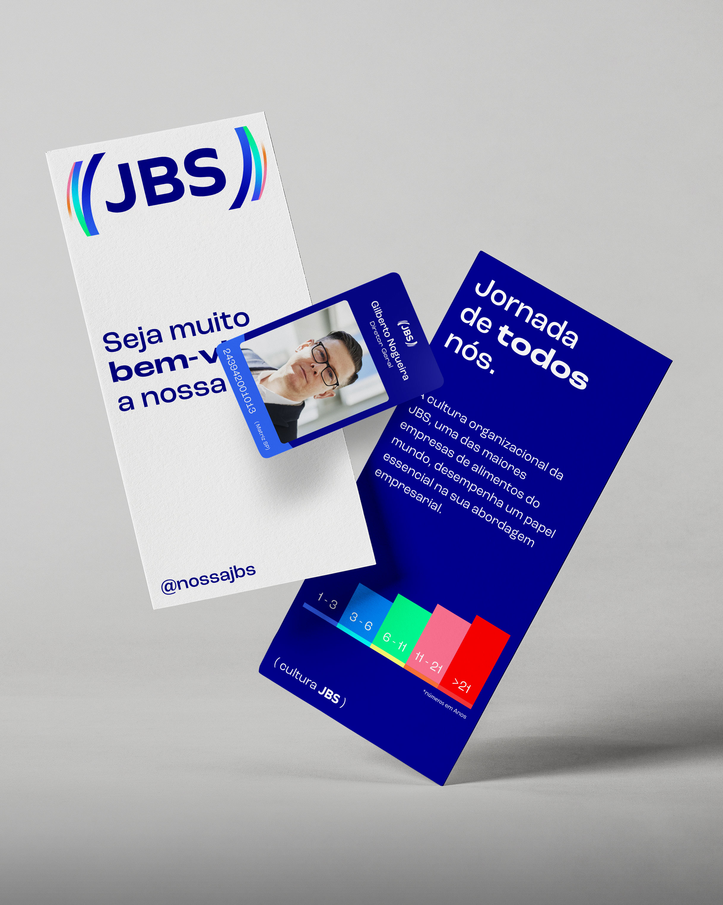
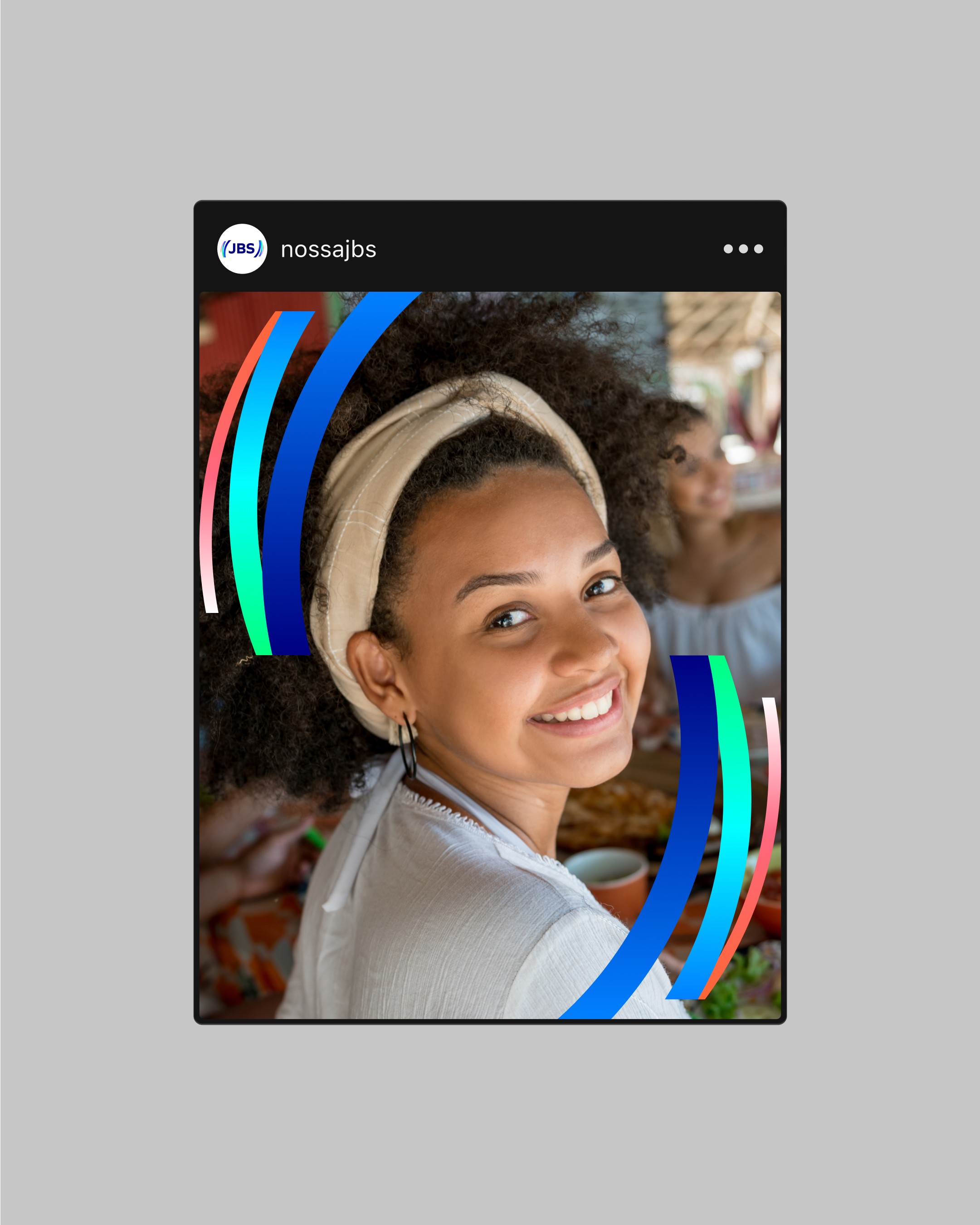
The new identity is built around a simple idea: care. Care for the people who produce food, for those who consume it, and for everyone in between. At the heart of the visual system sits a symbol made of parentheses, a quiet gesture of protection and connection, linking the company to its partners and to the world it feeds. That same form becomes the engine of the brand in motion. The parentheses open, breathe, and move. Not to impress, but to express something true about how JBS operates: continuously, across borders, across cultures, always in relation to others. There's a rhythm to it that feels less like a machine and more like a living thing. The color palette was enhanced to carry more weight and intention. Blue, deepened and refined, grounds the brand in trust and solidity. From there, a broader range of tones opens up, reflecting the diversity of its products and people that make up what JBS is. Green closes it out with purpose: a commitment to the land, to the future, to doing this responsibly over time.
CREDITS
Creative Direction: Ewerton Mokarzel, Arnaldo Bastos, Nélio Bernardelli Design: Nélio Bernardelli, Felipe Souza Motion: Franscisco Fernandes Agency: FutureBrand
VISUAL IDENTITY
LOGO
MOTION