FELIPE SOUZA — CURRICULUM
Brand designer working from strategy to design, crafting narratives that connect people to businesses, products, services, and purposes.
By uniting strategy, visual identity, and motion, I help brands design not only how they look, but how they behave. Creating identities that are intentional, expressive, and built to grow — strengthening meaningful connections between brands and people over time.
I see branding as a living system, designed from its very first idea to define how it moves, speaks, and evolves over time. Typography plays a central role in this process: it sets rhythm, hierarchy, and tone, shaping how a brand is read, felt, and remembered.
Currently
Open for business
Previously
Senior Designer at TOLD, KSA.
WORK EXPERIENCE
TOLD
2024 — 2025
Based in the Kingdom of Saudi Arabia, TOLD is a leading branding agency.
As a Senior Brand Designer, I led and contributed to branding projects across a diverse range of clients and industries. My responsibilities included developing brand concepts from strategy to execution, creating custom typography systems, and translating brand narratives into dynamic visual and motion-led expressions
SCOT
VISUAL IDENTITY
LOGO
MKT ANALISYS
CUSTOM TYPE
MOTION


The Saudi Center for Organ Transplantation organizes organ donation and transplantation services in Saudi Arabia. It oversees programs, promotes awareness, and enhances preventive measures against organ failure diseases among community members and healthcare practitioners.
Rooted in the concept of “Interwoven Lives,” the design draws inspiration from the technical process of sewing—the connection of organs. It echoes Madeed’s role as a unifying thread between donors and recipients, bridging lives with precision and care. Just as veins and arteries sustain life, Madeed sustains hope through its seamless system of collaboration.
The client initially sought a symbol, but through strategy and the strength of the design concept, the wordmark proved powerful enough to shift perspectives. This led the client to take a step back and refine the brand name itself, as the original acronym “SCOT” resembled the word “silence” in Arabic. The process ultimately guided the transition from SCOT to MADEED.
All rights reserved to TOLD.
SERA
VISUAL IDENTITY
LOGO ANIMATION
MOTION BEHAVIOR
LOGO REFINEMENT
SERA is the official regulator for the electricity sector in the Kingdom of Saudi Arabia. Its mandate includes licensing and oversight of electricity providers, establishing and enforcing technical performance standards, protecting consumers, regulating tariffs, and ensuring reliability and transparency across the sector.
The pattern is inspired by the visual language of electricity, with energized lines that carry power and vitality. As they move, these lines embody flow and continuity, expressing the brand’s promise of reliable energy that lights up every corner of our world.
In here, I was responsible to bring a fresh and unique patterns style in movement to represent the energy flowing.
All rights reserved to TOLD.
INDEPENDENT
2023 — PRESENT
After years in branding and strategic design, I transitioned into an independent practice, leading branding consultancy and creative execution for clients across the financial market, SaaS, beauty, and other segments.
As a Design Director, I build and manage tailored micro-teams for each project, aligning the right creators with the challenge. I bridge strategy and execution — from custom typography to interactive digital tools — delivering brands with precision, craft, and technological depth.
Clients include Teva Indices, Geonav, and more.
TEVA INDICES
VISUAL IDENTITY
LOGO ANIMATION
MOTION BEHAVIOR
LOGO REFINEMENT


Working in close collaboration with the Teva team, we immersed ourselves in their culture, tools, and way of thinking. From their internal knowledge to a surprisingly intimate library of books, financial journals, and editorial layouts, we uncovered a world of references rooted in bold grids and information-first design. Guided by deep strategic research and brand analysis, we arrived at a clear and resonant brand purpose: “Building the foundations of financial evolution.” This idea became the strategic compass — anchoring every decision, shaping the visual language, and informing how the brand shows up across every touchpoint.
TEVA NXT
VISUAL IDENTITY
LOGO
MKT ANALISYS
CUSTOM TYPE
MOTION
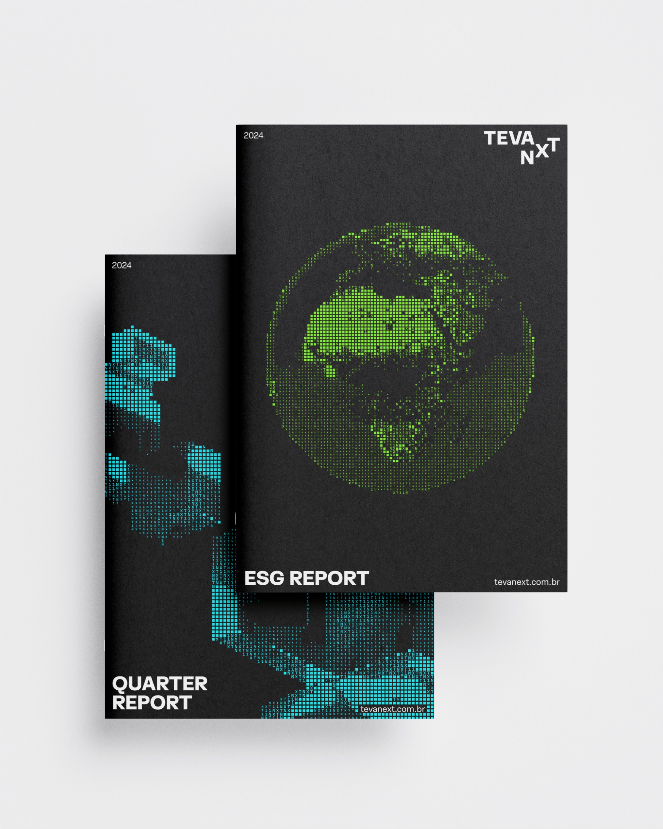


Teva NXT delivers tailored investment and portfolio management solutions for offices and advisory firms, operating across all asset classes. Guided by the purpose of “making the Brazilian financial market more efficient”, Teva NXT relies on proprietary technology to generate unique insights. It combines financial science in the creation of systems and decision-making models with an obsessive focus on risk—always seeking return while preserving capital.
GLOYN
VISUAL IDENTITY
LOGO
MKT ANALISYS
MOTION


Gloyn is aa upcoming beauty brand based in São Paulo, Brazil. From strategy to design, we came up with the brand idea "daily glow", that leaded the design. The glow sparks every woman personality, making them glow. The "ö" (letter o with diaeresis) became a strong symbol, that connect and sparks the glow and make the brand and consumers shine.
All Rights Reserved — Brand still not live
GEONAV
VISUAL IDENTITY
LOGO
MKT ANALISYS
CUSTOM TYPE
MOTION


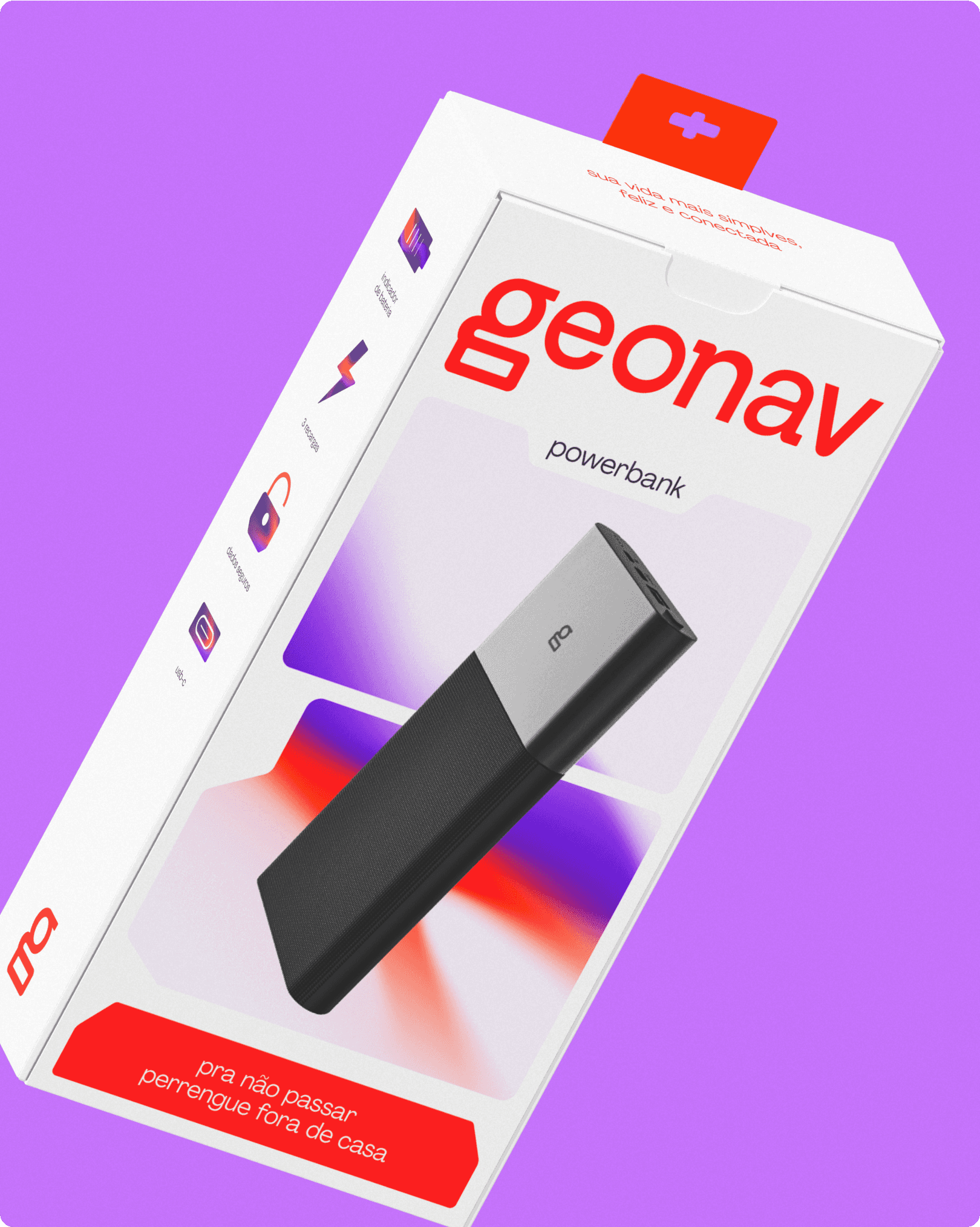
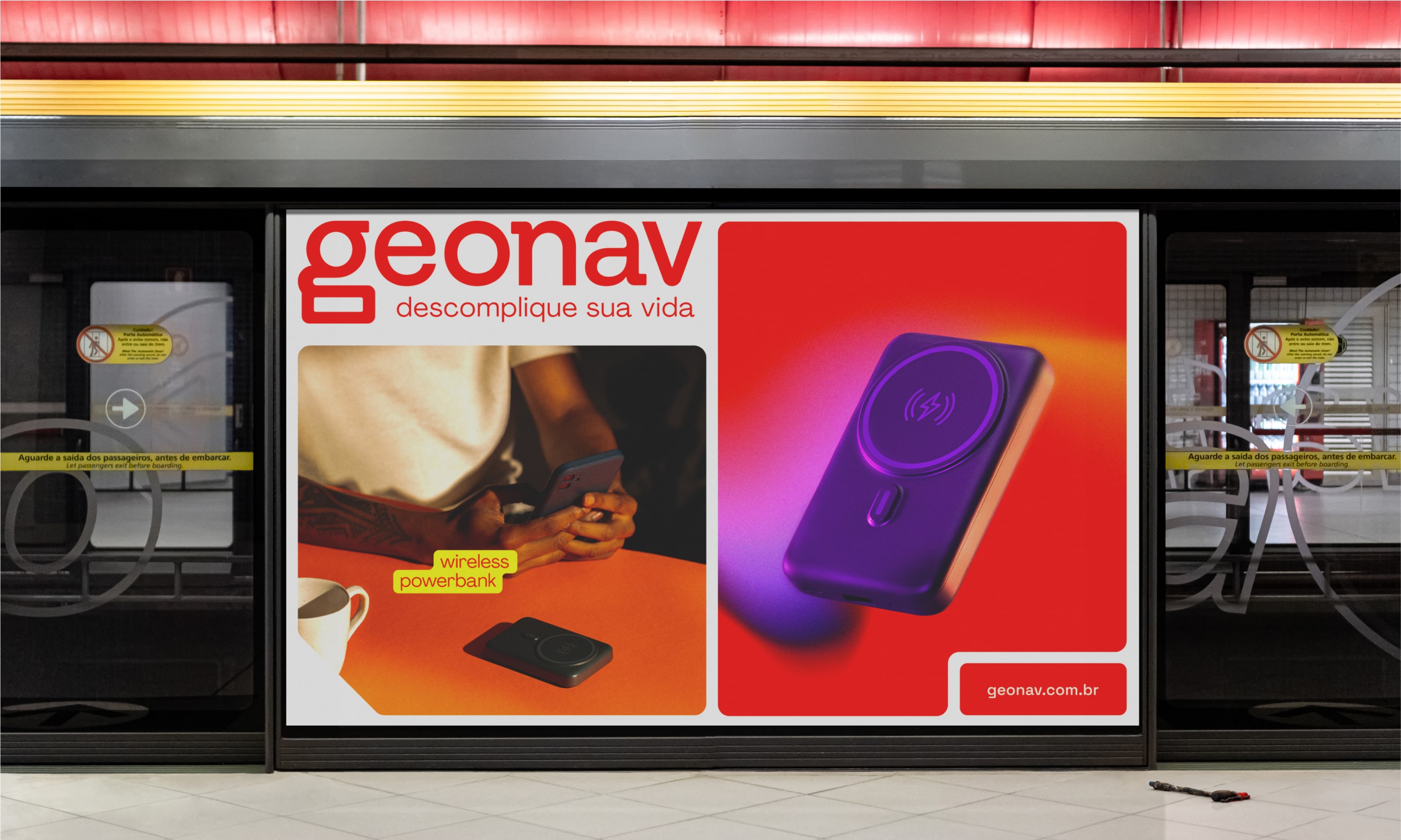
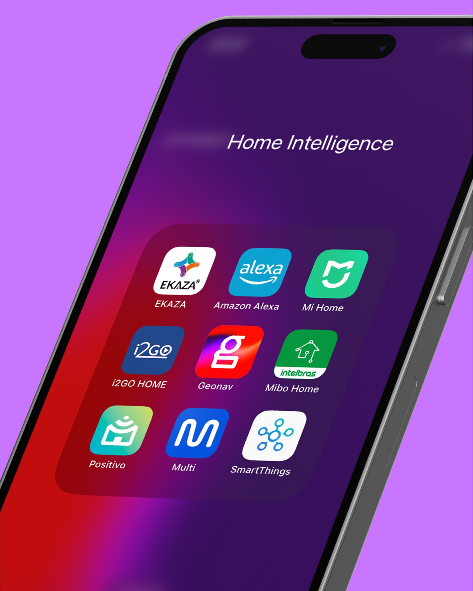
Geonav aims to expand its operations and establish a direct relationship with the end consumer (B2C). To achieve this goal, it is crucial to deepen the understanding of the peripherals segment, comprehending the functional and emotional benefits of the products and services offered. Operating in a highly competitive and constantly evolving market, it was necessary to reposition itself by redesigning its identity and incorporating distinctive elements that generate differentiation and prominence.
FUTURE BRAND
2019 — 2020
At FutureBrand São Paulo — one of the world’s leading branding consultancies — I contributed to major national and international projects, including the revitalization of JBS, brands for B3 subsidiaries, and strategic work for Banco do Brasil.
I expanded my expertise in strategic design, brand architecture, and creative direction, supporting junior designers and ensuring visuals were aligned with brand strategy, competitive gaps, and market positioning.
VISUAL IDENTITY
MOTION BEHAVIOR

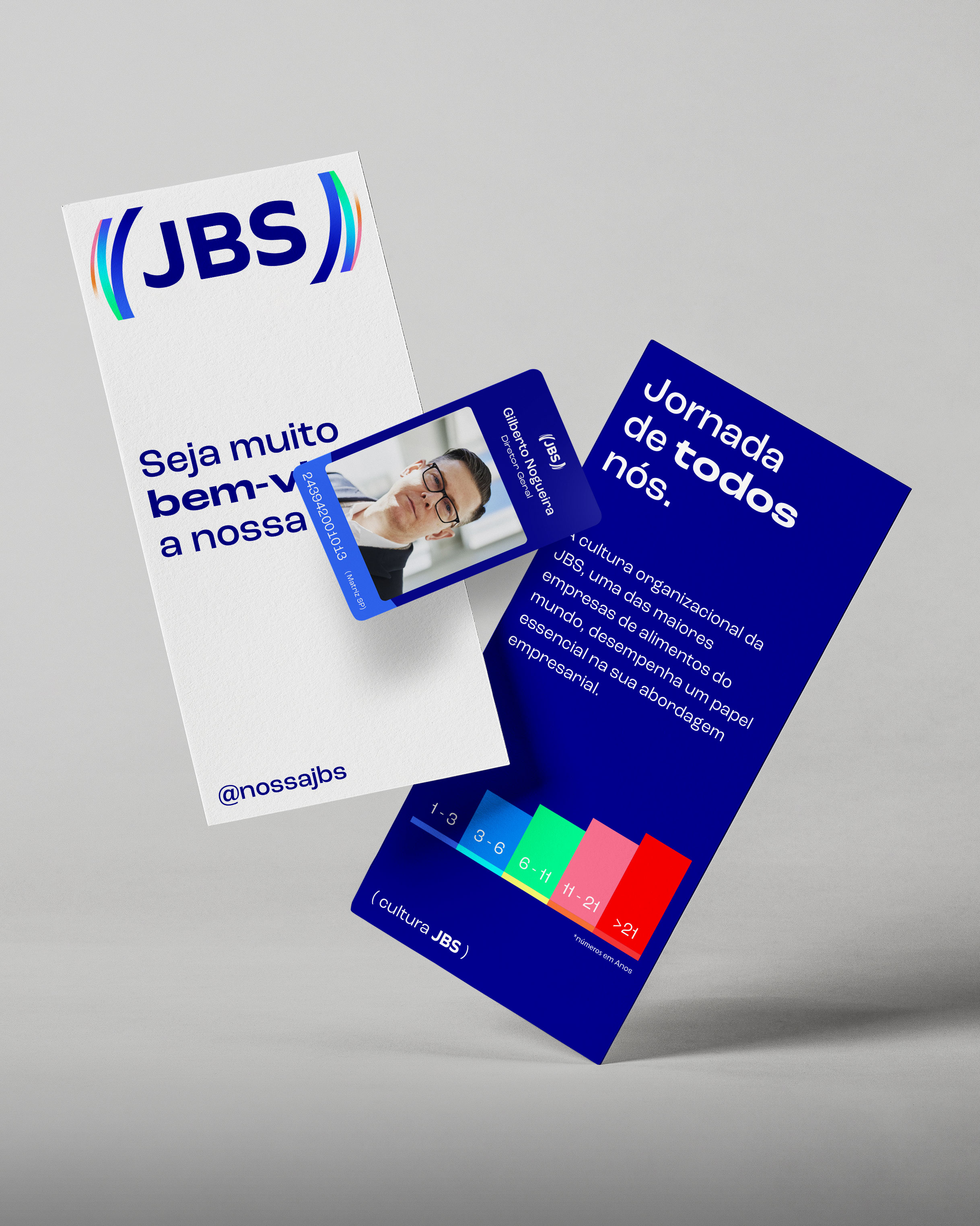
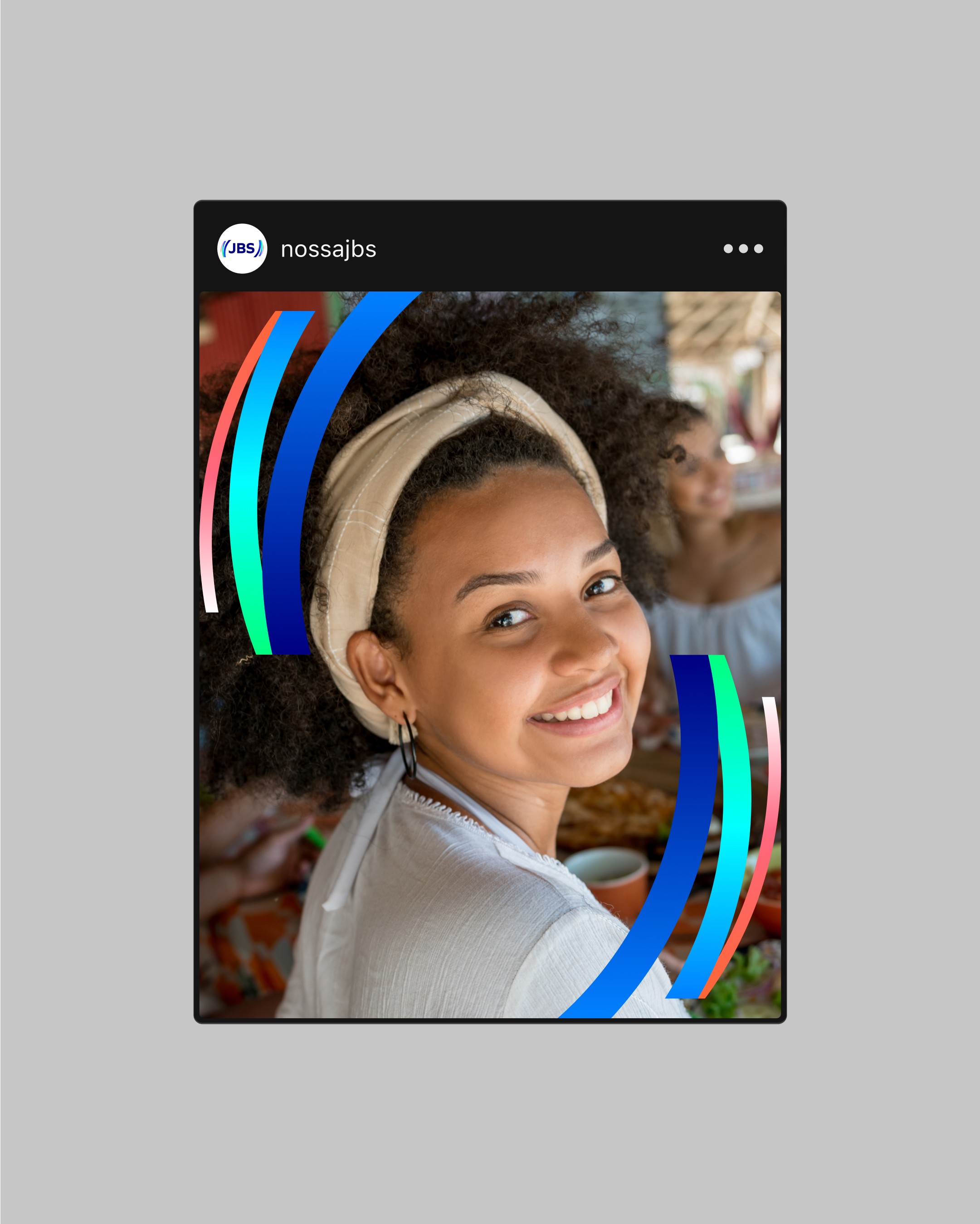

The JBS, at 70 years old, unveils a brand to the world that mirrors its incredible journey of development from its humble beginnings in 1953 as a small butcher shop in Goiás to its current position as one of the leading global food corporations.
Born from a simple butcher shop in Goiás in 1953, JBS, now at 70 years old, introduces to the world a brand that symbolizes its extraordinary growth trajectory to become one of the largest global food companies.
VISUAL IDENTITY
LOGO REFINEMENT


Their portfolio of products and services was very wide, but a most of its audience is unaware of these offers.
Part of this problem is communication, each region communicates in their own different way, with zero consistency, weakening the brand building efforts. What they need was a clear organization of its products, both visually and strategically. The new visual identity leaves the century-old classic brand image and aims at the future, bringing a desired and innovative aesthetic.
VISUAL IDENTITY
CUSTOM TYPEFACE


The MUB3 was born from the desire to preserve and share the history of the Brazilian capital market, through a powerful knowledge platform open to everyone interested in the subject and those who research it. The collection, sourced from the main stock exchanges in Brazil, enabled the creation of the Museum, which now forms part of a network of cultural institutions in downtown São Paulo dedicated to economic history.
It would be impossible to tell the story of the Brazilian capital market without mentioning B3, one of the leading financial market infrastructure companies worldwide. In this context, the challenge was to establish the relationship between brands in a way that best highlights the strategy proposed by MUB3, creating a unique concept that will inspire and guide the experience and expressions of the MUB3 brand.
VISUAL IDENTITY
CUSTOM TYPEFACE
MOTION BEHAVIOR


Believing in the convergence of the financial market with the technological advancements brought by digital assets, B3 Digitas is a company within the B3 Group that specializes in providing infrastructure and B2B and B2B2C solutions for the digital asset ecosystem.
COLLETIVO DESIGN
2019 — 2020
At Colletivo — considered one of Brazil’s most awarded design studios — I worked on highly crafted branding and packaging projects known for expressive illustration and strong visual storytelling.
As a Brand Designer, I created custom type, packaging, and brand identities for business from chocolate to real estate, contributing to the studio’s signature inventive and authentic design style.
VISUAL IDENTITY
LOGO ANIMATION
MOTION BEHAVIOR
LOGO REFINEMENT


Casa Flora, founded in 1955 with the production of “Queijo Flora” in Minas Gerais, has over the decades grown into one of Brazil’s largest importers and distributors of wines, beverages, and premium foods. Today, it operates as a gastronomic curator with a portfolio that brings together thousands of items from more than 30 countries.
VISUAL IDENTITY
LOGO ANIMATION
MOTION BEHAVIOR


Beds is a student co-living located in Brazil, focused on university students who need to migrate from their home state to be close to college.
VISUAL IDENTITY
LOGO ANIMATION
MOTION BEHAVIOR
LOGO REFINEMENT


Founded in 2015 with the purpose of being an innovative brand in the chocolate segment, GoldKo has gained space in the market for the quality and flavor of its products. Since then, GoldKo has positioned itself as a pioneer in the “sugar-free indulgence” niche, building a portfolio that includes chocolates, bonbons, marshmallows, protein bars, sorbets and café items, all with zero added sugar.
RECOGNATION
EDUCATION
SAY HI →